This article is the continuation from a previous article where I explained my goal of identifying the value of House Market in Munich in order to buy a house.
Since I get the data, buying a house in Munich is out the question, I don’t (and probably will never) earn enough to actually realize that but the data are still interesting in order to do a quick look at data analysis with pandas.
The first article was really focused on cleaning the data, because in order to do realize a proper data analysis you need clean data. Otherwise, you will stumble on a lot of issues when running your code. Also, I really like the saying that state : “Garbage in, Garbage out”
If you don’t clean your data, then you could analyse wrong data points and it would give you wrong results.
On this article, we will go deeper on what the pandas library can do for you regarding the analysis of your data set and some visualization. I like the idiom “A picture is worth a thousand words“. I am also very visual so it really helps to picture what you are seeing in your data set.
Pandas methods overview
At the very beginning, by importing the last version of the data set (that you have cleaned or retrieved from my github account), you can start by doing some method that will give you some information.
import pandas as pd
df = pd.read_csv('data_immo.clean.csv', delimiter='\t')
df.head(1).T ## I like the transpose function as it gives you a better view
df.describe() ## Always worth checking
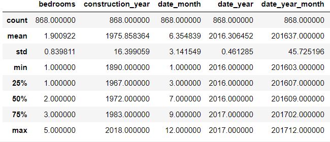
As you have probably noticing, we have the same number of count for each column. Thanks to our cleaning, all of the remaining data are available for us to find some interesting information.
As you probably have realized by now, this data set is a time series, it means that there is a timestamp-like column and that would enable to see evolution of the data set over time.
This can be useful for our analysis, seeing if there is a evolution.
In order to set the time series, we would need to use some method to identify which column is containing this information and how to translate it into the pandas data frame.
You would want (but not need) to import the datetime library and transform the date_year_month column.
We import the datetime if we want to actually do other stuff from the datetime column we will create from this translation.
import datetime
df['date'] = pd.to_datetime(df['date_year_month'],format= '%Y%m') ## This will create a new column that contains your datetime element
##Let's not stop here and analyze the different element identified in that column
df['date'].value_counts() ##Unique values and number of occurences
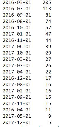
We see that the April 2016, May and December
2017 have low number of values.
We need to remember that in order to not get conclusion on those month. Not enough data points to assume anything there.
Continuing from having an idea on your data set, you can realize some easy visualization in order to analyse your data set or just a series.
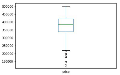
If we want to see the distribution of the price, we can realize this kind of box plotting
ax = df['price'].plot(kind='box', title='box plot visualization - price') #return an object from matplotlib
ax.set_ylabel('price')
ax.set_xlabel('data set')
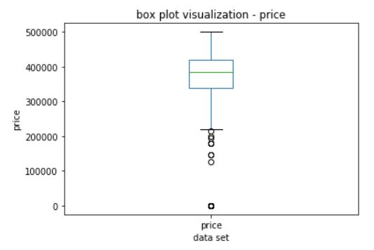
Here you can see that most of the values (25 – 75%) are within 210 k and 500 K€.
But you can also see some extra point and more importantly, it seems that there are data points to clean. We have a price for it but it is 0, which is impossible, even if I would really like this.
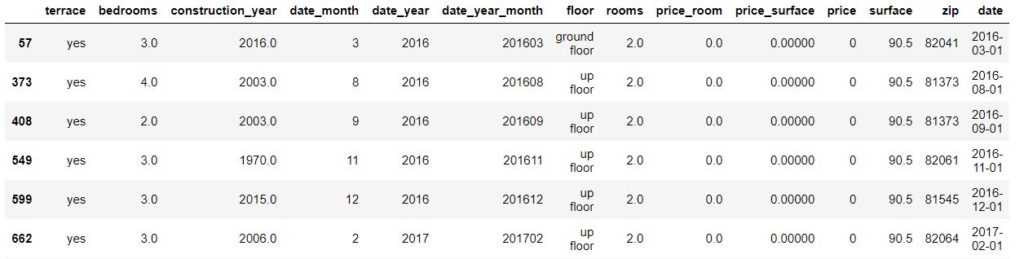
df[df['price'] == df['price'].min()] ## look for the data that match the minimum.
## In case you want to have some margin against the minimum, you can do something like this

df[df['price'] < df['price'].min()*1.1] ## Will take everything below 10% more than the minimum.
## it doesn't work in our case as our minimum is 0 but we can set a hardcap nothing below 50K.

df[df['price'] < 50000]
Let’s keep them for now, we could use that data later on.
We are just removing them away from the main analysis and keep them in a separate data frame.
df_0_price = df[df['price'] < 50000].copy()
df_0_price.reset_index(inplace=True,drop=True) ## let's reset their index
df = df[df['price'] > 50000]
df.reset_index(inplace=True,drop=True) ## let's reset their index
df['price'].plot(kind='box')
I think that this part is really a good example of what you are doing at your actual job. Even if you have spent some times cleaning your data set, you will always found something to clean afterwards when you are realizing the analysis. This is the moment when you are actually digging on data and you will face this kind of situation quite often. Re-cleaning the data.
Getting back to the analysis, an interesting method from pandas is to look if there are correlation between 2 variables.
In order to do that, you can use the corr() between 2 series.
df[['date_year_month','price']].corr()
## returns 0.42 : So positive correlation, price are increasing with time
## note that we are taking the 'date_year_month' data that are a number such as 201801 so it increased over time.
df[['rooms','price']].corr()
## returns 0.093 : No correlation between price and number of rooms.
## But this can be biased by the few number of different room number.

df['rooms'].value_counts()
## returns 3 values 2 (821), 3 (24), 4 (8).
## The over representation of 2 rooms will bias the correlation here.
One of the interesting to do with your data is to see reverse the view on them by grouping element by categorical data. If you know a bit of SQL, you will tickle directly on the word “grouping”. Yes the groupby function exists with pandas and it is pretty easy to use.
One of interesting analyze that we could do is to see the average price per zip code. In order to have really comparison, we will take the price per square meter (price_surface).
This will return a groupby object, the best would be to store it in a variable.
df_groupby_zip = df.groupby('zip')['price_surface'].mean() ## The good thing is that you can do a groupby on multiple elements.

df_groupby_zip_room =  df.groupby(['zip','rooms'])['price'].mean()
This method is actually very powerful. At this state, it gives a clearer view and a new way to see your data. You may also be like “that is nice, it gets ride of the complexity but I would like to know what is actually going on”
What if I tell you that you can work with this method in order to see what is going on (how many data points have been aggregated) but adding more calculation into a single command.
df_groupby_zip_agg = df.groupby('zip').agg({'price_surface' : ['mean','count','max']})
WHAT ???
Yes, it is that easy to get the average price per square meter per zip code and the number or data points and the maximum of each group aggregation. The .agg is definitely something you need to remember.
As you could have guessed, it would just requires that we add another column name in the dictionary to actually take another column into account(with the appropriate calculation you would like to apply to it).
The problem comes here as the price_surface column will have a multiple index and this is not easy to deal with.
The way I use to select only one column from the price_surface data type is to use .loc[] selection.
df_groupby_zip_agg.loc[:,('price_surface','mean')]
Pandas Visualization
Pandas has matplotlib integrated in order to realize some easy visualizations.
You have already seen the boxplot which is quite interesting to have a view on your data set distribution. On the next part of this article, we will see how to create such visualization in order to see your data set.
In order to see the visualization, you want to write this line of code :
%matplotlib inline #will generate the graph in your console
As I explained earlier, the cool thing with our data set is that it is a time series.
To really get the most of this kind of data, you want to have the datetime column to be on your index.
Once you have done that, all the plot will be generated in a time series manner.
ddf = df.set_index('date')
ddf_gby_mean = ddf.groupby('date').mean()
ddf_gby_mean[['price_room','price']].plot()
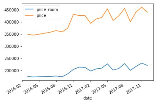
This is a very basic plotting though.
You could change the type, using the kind attribute but there are so much more attributes you can use. The most useful ones for me are :
- kind : determine the type of plot, my favorite being barh or bar.
- figsize : takes a tuple to resize your graph
- title : give a title to your graph
- cmap : use a different color map, link to some docs
ddf_gby_mean[['price_room','price']].plot(kind='area',title='price per room & price overtime',figsize=(10,7),cmap='tab20')
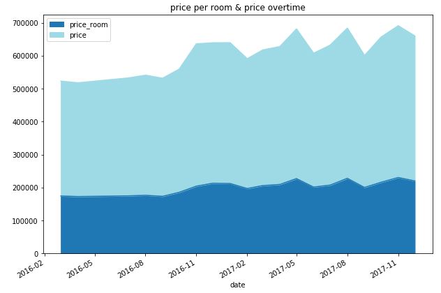
You can clearly see an evolution in the data set starting November 2016.
We get a higher price average, this may be because the maximum has been increase. I can tell you that is the case but let’s look at the data to confirm that.
graph = pd.DataFrame(df.groupby('date').agg({'price':['max','count']})) ##setting a new view with groupby
ax = graph.loc[:,('price','max')].plot(kind='line',title='Maximum price per month',figsize=(13,6))
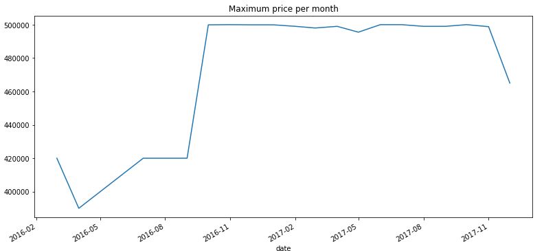
You can clearly see that I increased the maximum price that I was looking for. This is because the price in Munich are so high that there are no other choices.
Pandas graphic representation are quite useful and will help you to get a good understanding of your data. However, you can also use other plotting library that have some advance visual representation. This topic will deserve another blog post by itself but let’s look at another one, which is quite easy to use and can be quite powerful for additional graph visualization : seaborn
import seaborn as sns
sns.relplot(x="construction_year", y="price", hue='rooms',sizes=(20, 400), alpha=.7, height=10, data=df)
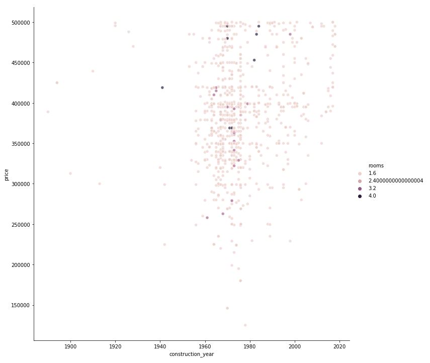
Easy enough to visualize the price by construction year and number of room ?
We can see that most of the offer in the market (for my price range) is for between ~1960 till ~1990. There are even building that have expected construction year till 2020.
Overall, the usage of plotting functions are often coming from a wrapper around matplotlib.
Therefore, you should really start to know what this library is about so you can better integrate the possibilities that it offers.
I hope this post was helping on knowing how to use pandas to actually doing basic data analysis. I planned to cover more topic but this is already quite long.